What you can't tell about a book by its cover
On making a book cover together
As a traditionally published author, I never got to talk to the people who designed my book covers. Sometimes, as in the case of my textbook or Throw Like a Girl Cheer Like a Boy, I did give some general suggestions. But there was always an intermediary between me and the people doing that design work. I gather this might not be the case for everyone, but it was for me. Mostly my input consisted of saying what was or wasn’t.
Needless to say, the experience of designing the cover for Fair Game, my young adult novel about a girls basketball team that challenges the boys to a high-stakes game, has been different. I asked a local graphic designer, Cheryl Liz Clarke, to do the cover.
In addition to being an amazing graphic artist, Cheryl is a former student of mine. For her final project in my introduction to sociology class, she played protest songs on her guitar, which was awesome. Before that, I knew Cheryl as the best barista at my favorite coffee shop in town. This was about three previous iterations ago, during the dark ages of coffee in Madison, when ordering a cappuccino was always something of an adventure. This made Cheryl famous as someone who might both know what a latte was and have actually tasted one herself.
Fast forward years later and when I got married, I asked Cheryl to play the songs for our wedding ceremony—“All My Days,” by Alexi Murdoch and “Like a Rose,” by Lucinda Williams. Having never picked up a guitar myself at the time, I didn’t know how difficult the Alexi Murdoch song might be to play, but Cheryl practiced and it was perfect, like everything else about our wedding day.1
When the pandemic hit, the first mask I bought was made by Cheryl, who is also a skilled seamstress. I bought the mask not because I seriously thought I’d get much use out of it—I mean, how long could a pandemic last, right? I bought the mask because it was so damn cute—red with a different pattern on each side.
Now, Cheryl’s added to her extensive skillset. She’s a farmer. An herbalist. A Saturday morning farmer’s market performer. A truly multi-talented woman who I’m lucky to have in my community.
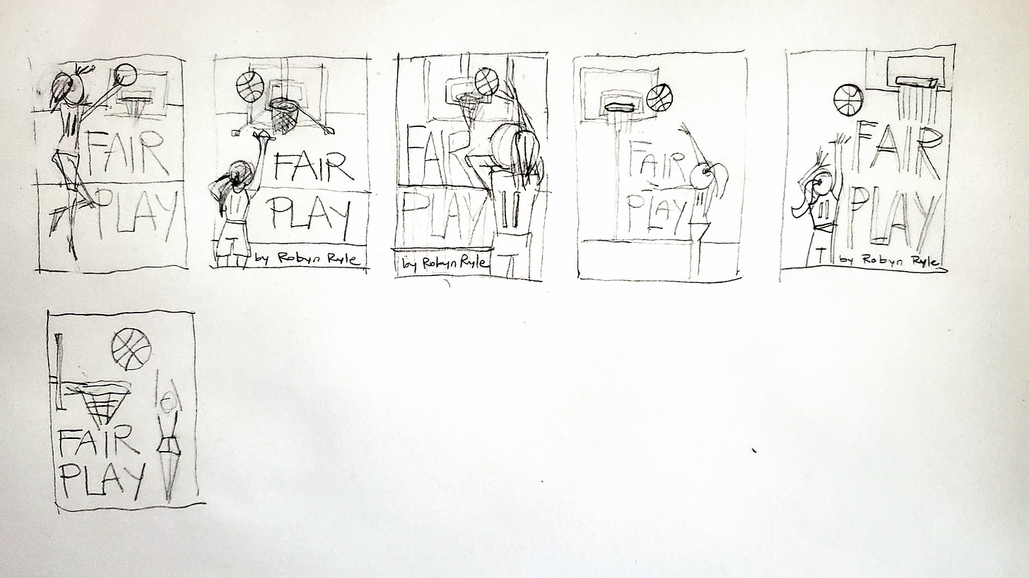
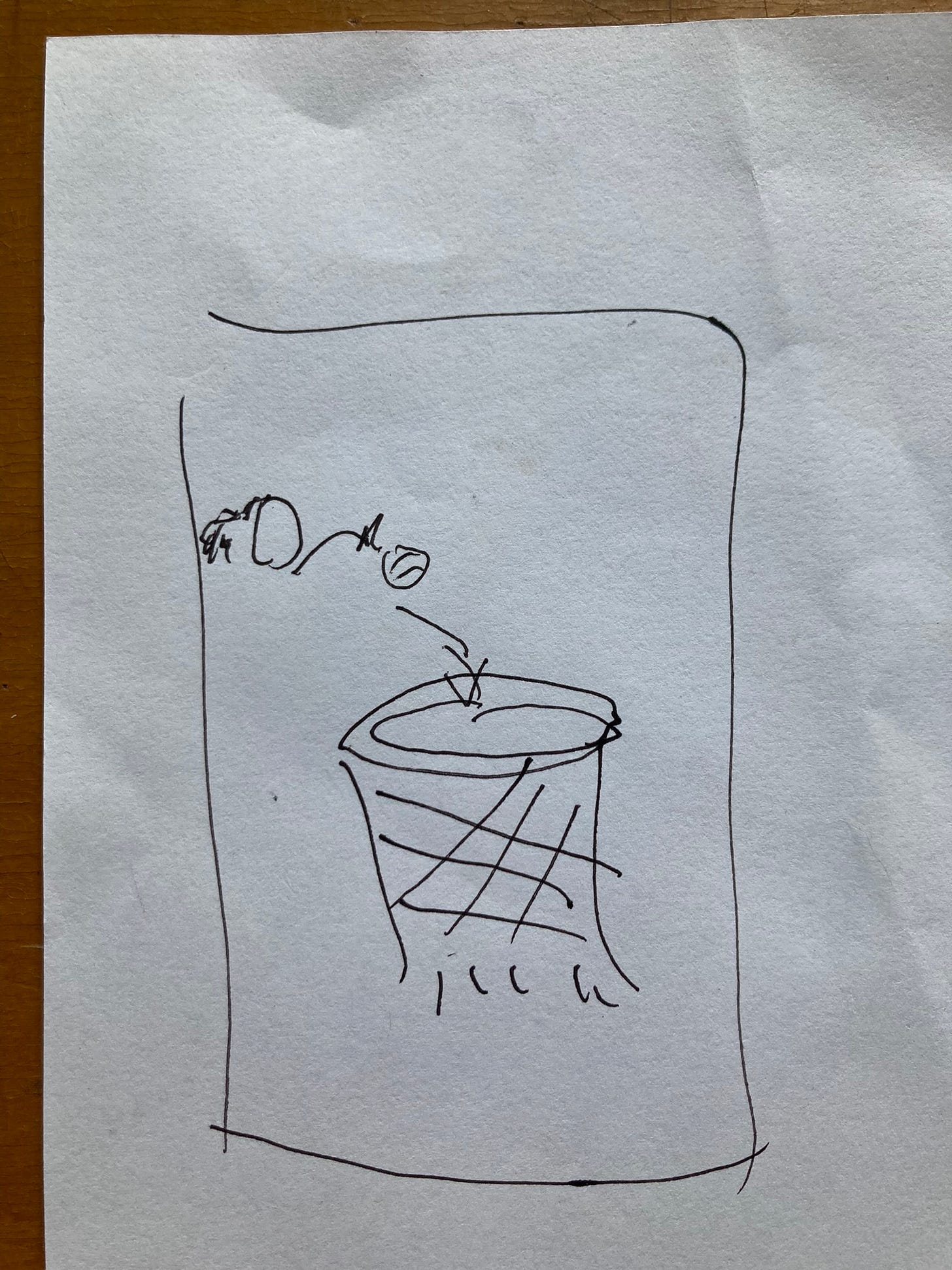
Cheryl and I sat down at a table in that same coffee shop where we first met to talk through the cover. She asked if I had any ideas and I shrugged. “Not really,” I said. Then I proceeded to draw out a very specific design I guess I’d had in my head without knowing it—the image of a ball about to go into a basketball hoop—which is part of a very pivotal scene in the book (no spoilers—you’ll have to read it). I imagined the hoop centered in the foreground and the player who’d made the shot in the background, but this is where Cheryl’s design sense came in, as the flow didn’t quite work. She read the book (another bonus, as I needed all the eyes I could get to catch any errors) and sent me some rough layouts to choose from.

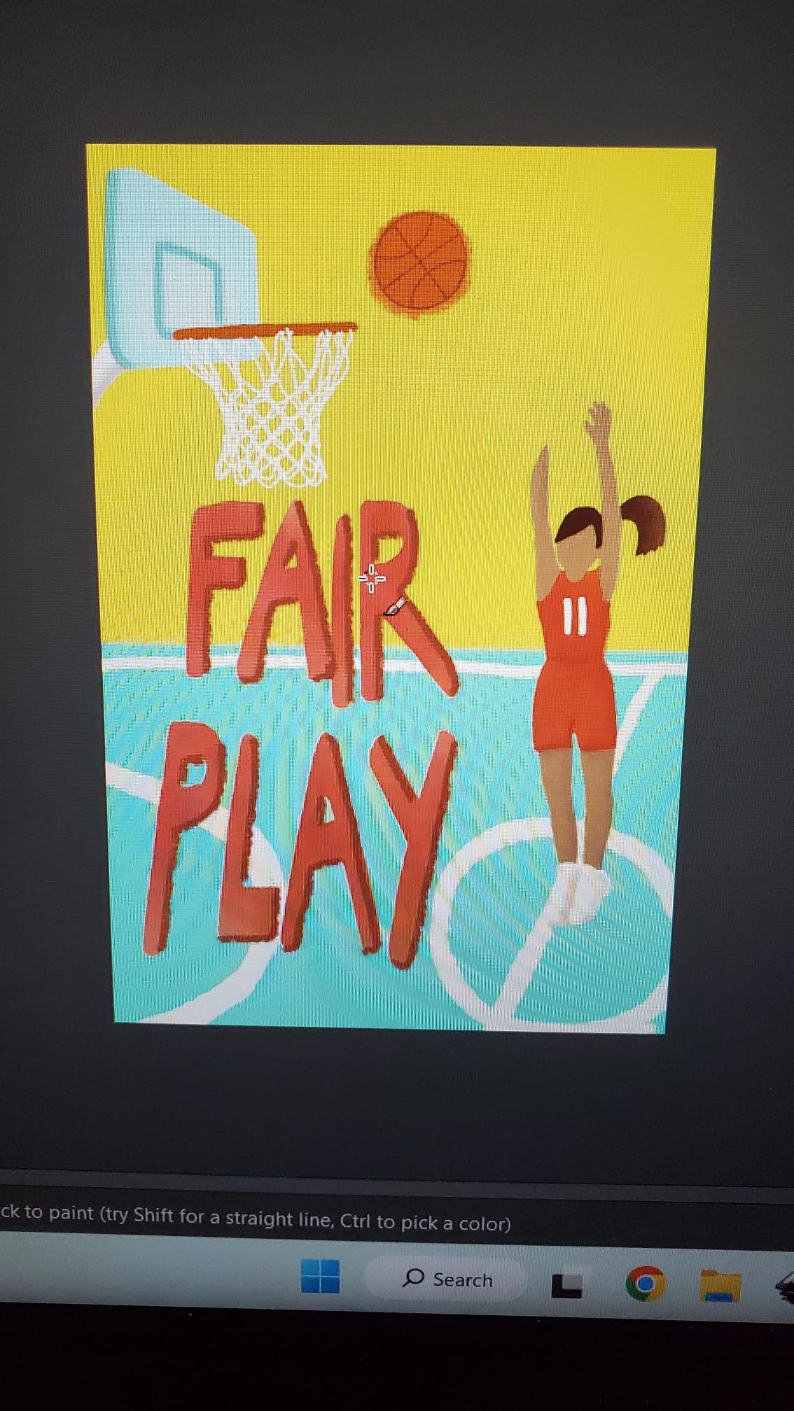
I also got a lot more input on the color scheme. No pink. Somehow pink has been a part of so many of my book covers despite the fact that pink is one of my least favorite colors. I wanted bright oranges and yellows.
Cheryl and I also debated about whether the girl on the cover should have a face or not. My husband was staunchly anti-face. The facelessness meant the girl on the cover could be anyone. Which was a good point, but also maybe a little weird to have a faceless person on the cover of your book? There is certainly a lot of facelessness on book covers lately, but usually because the woman’s back is turned on the cover. I have no idea what this trend is about, but I will confess that I now refuse to read any books with a woman whose back is turned. I know, it’s weird. Still. I sent Cheryl some examples of covers with faces to work from and to give her an idea of what I had in mind if we did go with a face.

I realized, in the process of designing a book cover why it often takes so excruciatingly long. If you want to put a blurb on your book cover, you have to first get the blurb. For the publishing un-initiated, a blurb is a fancy word for those quotes from other writers or sometimes newspapers or websites or magazines you see on the covers of books. More on my amazing blurbs and the people who wrote them later. But if as a publisher, you’re waiting to see if Kirkus or Booklist or one of those powerhouse reviewers decides to review the book, the cover also has to wait.
Then I figured out that the whole of the cover—front plus spine plus back cover—couldn’t be fully finished until I knew the page count, because the page count dictates the width of the spine. The page count can’t be calculated until the inside of the book has been formatted. So we had to wait on the person I hired to format the inside of the book before we could move forward with the cover. So like most things related to books and publishing, the cover took longer than I thought it would, but it was worth the wait.
A book cover is a strange thing. It communicates so much with so little. Is this book serious? Funny? For kids? For adults? Covers can tell you the genre of the book. Two scantily-clad people embracing on the cover equals romance. A spaceship probably tells you it’s science fiction. A elf is fantasy.
I judge books by their cover all the time (see no books with women whose back are turned above as exhibit #1). I look at the image on the front. I read the back cover summary. I check out the blurbs, looking to see if any authors I already know and like recommend this book.2 I always read the author bio, because, yes, I’m comparing myself to the author (I know, not a good look, but can’t help it). But also, if the author is writing about, say, Mississippi, I want to know if they’re from Mississippi.3 A book cover is a big deal, so in some ways, leaving it in someone else’s hands is a relief. If it sucks, at least it wasn’t my fault.
But also, I’ve always been jealous of other art forms that are so much more collaborative. A sculpture friend of mine made these huge installations that were composed of thousands and thousands of cds tied together. To make those pieces, she needed people to donate the cds to her and then she needed armies of folks to drill the holes in the cds and help tie them together. Installing the final pieces took a whole team. Making a movie. Putting on a play. Being in a band. All so much more collaborative and therefore less lonely than writing.
So it was nice to be able to sit down at a table with a person I knew and liked and admired and figure all of this out, even with the twists and turns. Now when I see this beautiful book cover, I think of my book, yes, and the three women whose story it tells. But I also think about Cheryl and all her work. I think about the ways in which relationships in a community evolve and change over time—barista, student, musician, artist, collaborator. I think about the irreplaceable and complicated histories we build in the places we live. I think about the joy of trying something new with someone familiar.
All of that makes me love this cover all the more. I hope you love it, too. So with no further adieu, here it is.
When can you pre-order copies of Fair Game, you ask? Right now.! Pre-order the book here or here. You can also go mark the book as to-read on Goodreads, here. You might as well give it a 5-star review while you’re there (you trust me that it’s good, right?) Or share a copy of the cover on your social media (and maybe also use the hashtag #fairgamebook). Or—next level—go here and sign up to be part of my book launch team. Everyone who does gets a free e-copy of the book before it releases, on June 27.
Stay tuned as we get close to the release date for more posts about the amazing people who wrote my blurbs and about writing a book set in Madison and about the inspiration for writing Fair Game in the first place.
Not being cheesy when I say this, because I am not a cheesy person and my wedding was about the most low-key event you could possibly imagine. It was what I believe all weddings should be—a really great party with a little ceremony thrown in for the hell of it. Fun fact—the place where we got married is now a brewery. Well, sort of. A brewery that’s for sale if anyone’s interested and open on random occasion for musical acts.
As a writer myself, I also look at the blurbs because they can possibly tell you which writers are friends with other writers or connected to each other in some say. Living out here in the sticks of Indiana, I feel most of the time like I’m an outsider looking into the world of the ‘real’ writers, so the blurbs are a little like eavesdropping on the cool people at a party, or at least that’s how I feel.
I have strong feelings about this. Feel free to disagree. But if you’re not from Mississippi, you probably should not write about Mississippi. Does this apply to every place? No. You can not be from New York and write about New York all you want because let’s be honest, every other book you’ve read since you were a wee child has probably been set in New York, so don’t we all know New York by now? Yes, we do. But, trust me, we do not all know Mississippi. I lived in Mississippi for five years and I love Mississippi (yes, I do, I know, and if you don’t get it, you don’t, but don’t come at me if you haven’t lived there) and I still would not write a book about Mississippi, unless it was a book about Mississippi from an outsider’s perspective. Feelings.


I’ve pre ordered! Can’t wait to read
How exciting! I found this process quite interesting to read about. and really like the final iteration. Great blurb, too! I've pre-ordered a copy!